Showing posts with label quality. Show all posts

2025/06/21

The four anti-pillars of Marxism

Those who don't understand history are doomed to repeat it.... And those who do are doomed to watch in horror. 

In recent years, I've watched in horror Marxism seemingly coming back in fashion, as if we're in the 1920s. Too many people lack the practical experience, theoretical context,  or intelligence to know the lessons of the last 100 years. 

The seven pillars of wisdom in Christianity or the seven pillars of Islam are things you should build on. With Marxism, we have some seductive big ideas that you should not build on. I call them anti-pillars.  I won't explain them since many great people have before. I'll just list them as pointers.

1. Economic calculation problem and the fallacy of central planning.  

It is not just about having better computers or more data. The information in an economic system doesn't exist in one place or time, it is distributed. Furthermore, even if you had it all at once, much of it is not explicitly manifest but rather implicit preferences.

2. The labor theory of value is wrong

It is not just labor vs capital, there is also value and, more subtly there is quality.  If I spend an hour on the piano and Mozart spends an hour, it's one hour of labor. But there is a subjective difference in value. And an objective difference in price that others will pay for it. Finally, there is something that is neither objective nor subjective, beyond dialectics, namely quality.

3. The class struggle is a static one dimensional model, but human economic relationships are dynamic and multidimensional. 

This may have been subtle in the 19th century, but in the 21st century, it should completely obvious.  In fact even in the 20th century, class was often cynically replaced by ethnicity or religion by various revolutionary Marxists hungry for power. Lenin used "nations, nationalities and peoples" when he realized Russia was not industrialized enough for Marx's class structure. Ethiopian Marxist-Leninists adopted the same hack 3/4 of a century later. 

4. A political system based on class struggle necessarily evolves into an escalating war of purity. In this process, the most ruthless sociopaths, the self-appointed revolutionary vanguard, always end up as the rulers. Which is why almost every Marxist state converges on a violent totalitarian government.

If you are ever about to be to be seduced, at least know these anti-pillars, and spend a small amount of time understanding them.

2012/10/30

Time lapse #2

This one had a couple of adjustments.
  1. To get maximum depth of focus: set the aperture to be as small as possible (f/22) and let the shutter speed be automatically determined. By the last few frames, the exposure time is up to 3-4 secs. 
  2. To compensate for the lack of trains: added a hurricane!

2012/10/29

Time lapse

Here's a little experiment I did this weekend. My first ever time-lapse video:

It consists of:
  • one photo every 5 minutes, 
  • 101 images which become
  • a movie of 10 frames per second, 
  • for a speedup of 3000 x real life.  
Setup: 
  1. Plug camera into laptop via USB. 
  2. To remotely control camera: a program called EOS Utility which comes included with most Canon DSLRs. I'd never even looked at those discs that came with the camera, which is more than 3 years old.  Good thing I never threw them away! 
  3. To make the HD movie out of the JPEG images: Movie Maker tool in Picasa.
IMG_4427I'd assumed it was all going to be much more complicated but as soon as I started looking into it, it became obvious that everything I needed was already right here at my fingertips.  This reminds me of a previous little weekend project -- 100% wireless...   There ought to be a word for this, when things turn out delightfully easier than expected. The opposite of a bug. Let's call it a butterfly.

2012/02/16

Five books: Non-fiction

A few months ago, the New York Times had an article on the greatest non-fiction books. They asked 33 people to list their top 5.  (To my dismay, Kapuscinski's "The Emperor", one of the worst books of all time in my opinion, came out tied for the best of the best. That book is so bad that, when I tried reading it, I couldn't help but physically throw it away in disgust. My hatred for that book deserves a whole blog post of it's own. But this is not that post.)  Inspired by that article, I thought I'd try to remember my some of my favorite non-fiction books of all time. It wouldn't be fair to call it a "top 5", since I am not being that thorough.  If I sat down to do this ten times, I'd probably end up with ten slightly different lists.

Rather here are 5 non-fiction books I really enjoyed, that had a deep influence on my world view, and that just happen to bubble to the surface at the moment:

  • Gödel, Escher, Bach: An Eternal Golden Braid, by Douglas Hofstadter. Absolutely brilliant exploration of logic.  Recursion is just so... fundamental. The human mind must be an instrument of God. Made me love J.S. Bach (and "Alice in Wonderland").  And a proof of Gödel's incompleteness theorem. 
  • Guns, Germs and Steel: The Fates of Human Societies, by Jared Diamond. Very ambitious, basically the history of civilization organized around a few very compelling ideas. Geography is very very important. Innovation diffuses latitudinally.
  • Seven Pillars of Wisdom, by T. E. Lawrence. Supremely elegant writing. Story of the middle east during the first world war. Essential reading if you want to understand a lot of international politics today.
  • Life is long if you know how to use it, by Seneca. Beautifully concise stoic philosophy. Don't sweat status. 
  • An Autobiography, or The Story of My Experiments with Truth, by M. K. Gandhi. The great man's early life and journey to satyagraha, truth through non-violence.
Hmm, clearly 5 is not enough. Here are a few more that would be included in different iterations of the "top 5".
  • The Discoverers, by Daniel Boorstin. A masterful, sweeping history of science. Extremely educational.
  • An anthropologist on Mars, by Oliver Sacks. The human brain is really really interesting.  It's easy to not realize how amazing our vision, memory, etc. are ....  until something goes wrong.
  • The Autobiography of Malcolm X as told to Alex Haley, by Malcolm X and Alex Haley. Powerful life story. I learned a lot about the USA in this one.
Oh what the hell, let's make it an even 10:
  • Zen and the Art of Motorcycle Maintenance, by Robert Pirsig.  Not the best writer of the bunch, but this book had a profound influence on me. Key word: Quality. What is good? What is not good? Also, I'm not sure if I learned it in this book, but I believe that you should never get upset by something that was predictable.
  • Titan: The Life of John D. Rockefeller, by Ron Chernow. Very thorough biography of a fascinating man in a fascinating time. Very relevant today. If you are thinking of pursuing an MBA, don't. Instead, read books like this one.

2010/10/16

Design bugs in everyday life: hall of fame

Revisiting the subject of design bugs in everyday life, there really ought to be a "Hall of Fame" for such things, which I hereby inaugurate.

As first inductee, I nominate the typical North American cable TV remote control, like the one from Time Warner shown here. It's design is so atrocious it defies comprehension.

What is it about this object that I find so contemptible? Consider two operations on a TV remote that you really want to be quick and effortless. One is "mute"... When you need it, you need it fast. Another is "previous channel" -- probably the most frequently used button. In any sensible design, these two buttons would be large and as distinct as possible. Here they are the exact opposite, they are the tiny gray dots below the blue and red buttons. They are in fact the least distinct buttons on the whole thing!

This leads to the type of thing we've all experienced: you are watching TV, the phone rings,  your focus shifts completely to the phone call and with the little attention that you have left ofter, you fumble with the remote, trying to find the $*@%! mute button, meanwhile the TV volume seems to get louder, the phone call becomes more urgent, stress rises.... You get the picture.

On the other hand, the two largest and most visible buttons on the remote are "list" (to access DVR), bright green one, and "on demand" (to access video on demand), the big white square. But neither of those features, by definition, requires any speed... In fact they are meant to be accessed at a leisurely pace, that's the whole point of them! Perfect candidates for attractive but discreet buttons. But no, they get to jump out the most, screaming at you.

Why does this object have exactly the opposite of what you'd want in a good design? There is not even a lock-in effect, as described in the previous post, to excuse it. Maybe there's a less naive reason. The "on demand" button generates additional revenue for the cable company, so that could be why it gets featured strongly. But really, it can't make that much difference. How many times will someone order movie just because they saw the button? Once? For that tiny bit of incremental revenue they are willing to get in the way of the most essential functionality? It's like giving limousines priority over fire trucks and ambulances on the road!

But let's apply Hanlon's razor: Never attribute to malice that which is adequately explained by stupidity. They probably just don't give much importance to design at all. Recall these cable TV folks are the same people who, as I've noted before on the subject of the mythical DVR+P2P, seem completely capable of suicidally stupid fear and paralysis in the face of potential innovation.

The essence of good design is to deliver functionality efficiently, and from that the aesthetic flows naturally. Form following function and all that. For committing the most egregious violation of that principle that I can find, I hereby induct the Time Warner cable remote control to the Design Bugs Hall of Fame.

While we're at it, I might as well give them the second induction as well. Just look at the program menu on your typical TV. Why doesn't it have your most frequently used channels, like bookmarks, easily accessible at all times? Most people watch a handful of channels vast majority of the time. Does it make sense to have them scroll around or enter numbers every single time to find the same few needles in the huge haystack of 500 channels, over and over again? Why not present an automatically generated list of your most frequently visited channels, like the Firefox and Chrome browsers do with web pages? It would be a huge time saver, enormous usability win, a no brainer. They haven't thought of doing that, in the decades that cable TV has existed?  Contrast that with innovation in web browsers....

Cable TV subscribers.....  which I am not one of by the way,  imagine how much more I would complain if I actually used it!  But I digress. Fortunately, Cable TV subscribers can now root for the brave new world of software-driven television. Tivo, Boxee, Apple TV, Google TV, Netflix, et al, whatever they end up becoming, let's hope they manage to wrest the user experience from the sclerotic grip of the cable TV monopolies and their business model demons.

2009/11/08

Design bugs in everyday life

A long time ago, I think it was in the book "Information Rules", I read a great example of a pure inefficiency, a problem where everyone involved is worse off than they could be under a simple alternative scenario. At a deli or coffee shop, where coffee is served in disposable cups, it's better if the covers are the same size for different size cups (i.e. the circumference of the top of the cups is the same whether the cup is small, medium or large). Otherwise, people will waste time because they picked the wrong size cover and have to pick again, others will also waste time as they wait for them to get out of the way, some lids get wasted, the counter gets messier, etc. Many small problems arise from having different size lids.

It's a striking example because the difference between the right and wrong solution is so trivial. It's a design error, and if you realize it early on, the fix is virtually free but later it's very costly. Nothing new in that, that's exactly the nature of software bugs and it's not surprising that similar "bugs" exist elsewhere. But what really fascinated me in this example is that the bug, doesn't get fixed even in subsequent versions! You still have many coffee places that have different size cup covers, for decades, for no good reason.What a fascinating bug! It should have been crushed years ago and yet it continues to hang around generation after generation.

Since then, I've noticed other examples of design bugs in every day life that are surprisingly resilient. Some, like the one above, probably survive because the inefficiency occurs in such tiny increments, we don't appreciate the cumulative cost. Others survive because all they need is one chance to get into the system and then they are locked in forever. Here are a few random ones that I can think of right now:
  • Typographical Fonts where l (lower case L) and I (capital i) are hard to distinguish.... It seems like if you are designing a font, making letters distinct would be one of your first requirements, so how do these fonts survive, and even thrive? Imagine all the damage that has been done throughout history because someone misread a "l" as an "I"... it's hard to estimate but it must be huge. Maybe it caused a shipwreck at some point!
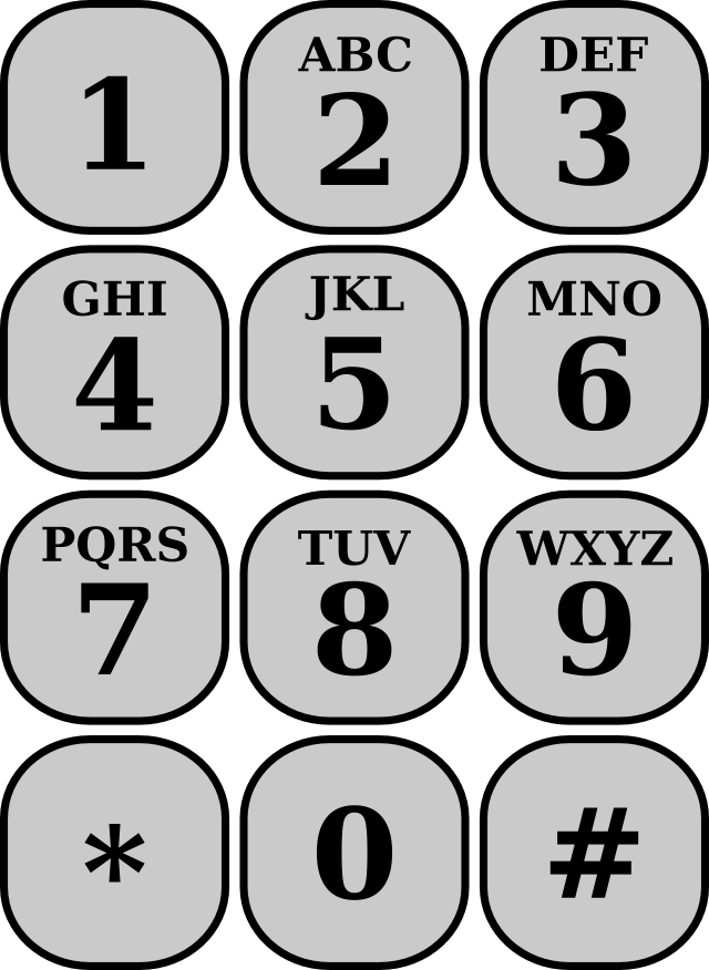
  • Alphanumeric key mapping on phones: a neat old idea which allows you to make memorable words out of phone numbers, like 1-800-FLOWERS. But let's look at that mapping on our phones We have 2: ABC, 3: DEF, 4: GHI, 5:JKL, 6: MNO, 7 : PQRS, 8:TUV, 9 : WXYZ , and 1 and 0 have no letters. This leaves a small doubt in a some cases: when you see O is it really an O which makes it a 6 or is it a zero? Similarly if I see a I, I'm not sure if I should dial a 4 or a 1. That's a bug in the design. The fix would obviously have been to assign I to 1 and O to 0, and then assign all the others alphabetically 4: GHJ, 5: KLM, 6: NPQ, .... with a nice side effect that now all the keys would have three letters on them (instead of two of them having 4 letters, or omitting Q and Z like they did in some old phones). Again a trivial fix but the design bug got locked-in, became the standard, and now it will never be fixed. Imagine.... maybe some lives were lost because someone wasted precious seconds by dialing a 4 instead of a 1!
  • Bank ATMs that give the cash before returning the card; it seems obvious that will cause a lot of people to leave their card behind which in turn is a huge cost for the bank and the customer! The fix is to design the machines to always return the card first and then proceed with the withdrawal or deposit. Fortunately this last bug seems more prevalent among older machines than newer ones, which hopefully means it's on it's way to extinction...