It's a striking example because the difference between the right and wrong solution is so trivial. It's a design error, and if you realize it early on, the fix is virtually free but later it's very costly. Nothing new in that, that's exactly the nature of software bugs and it's not surprising that similar "bugs" exist elsewhere. But what really fascinated me in this example is that the bug, doesn't get fixed even in subsequent versions! You still have many coffee places that have different size cup covers, for decades, for no good reason.What a fascinating bug! It should have been crushed years ago and yet it continues to hang around generation after generation.
Since then, I've noticed other examples of design bugs in every day life that are surprisingly resilient. Some, like the one above, probably survive because the inefficiency occurs in such tiny increments, we don't appreciate the cumulative cost. Others survive because all they need is one chance to get into the system and then they are locked in forever. Here are a few random ones that I can think of right now:
- Typographical Fonts where l (lower case L) and I (capital i) are hard to distinguish.... It seems like if you are designing a font, making letters distinct would be one of your first requirements, so how do these fonts survive, and even thrive? Imagine all the damage that has been done throughout history because someone misread a "l" as an "I"... it's hard to estimate but it must be huge. Maybe it caused a shipwreck at some point!
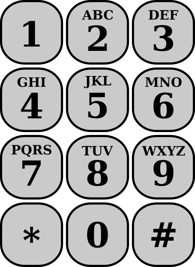
- Alphanumeric key mapping on phones: a neat old idea which allows you to make memorable words out of phone numbers, like 1-800-FLOWERS. But let's look at that mapping on our phones
We have 2: ABC, 3: DEF, 4: GHI, 5:JKL, 6: MNO, 7 : PQRS, 8:TUV, 9 : WXYZ , and 1 and 0 have no letters. This leaves a small doubt in a some cases: when you see O is it really an O which makes it a 6 or is it a zero? Similarly if I see a I, I'm not sure if I should dial a 4 or a 1. That's a bug in the design. The fix would obviously have been to assign I to 1 and O to 0, and then assign all the others alphabetically 4: GHJ, 5: KLM, 6: NPQ, .... with a nice side effect that now all the keys would have three letters on them (instead of two of them having 4 letters, or omitting Q and Z like they did in some old phones). Again a trivial fix but the design bug got locked-in, became the standard, and now it will never be fixed. Imagine.... maybe some lives were lost because someone wasted precious seconds by dialing a 4 instead of a 1!
- Bank ATMs that give the cash before returning the card; it seems obvious that will cause a lot of people to leave their card behind which in turn is a huge cost for the bank and the customer! The fix is to design the machines to always return the card first and then proceed with the withdrawal or deposit. Fortunately this last bug seems more prevalent among older machines than newer ones, which hopefully means it's on it's way to extinction...